
This is the impact board for this brief. i chose the large close up of the capaign strapline and the cropped in product shot as i think it gives the initial impact for the campaign and the products hat go with it, later to be shown in the following boards.

Again i wanted to show the individual products of the campaign but in an intriguing style by using the cropped in shots. possibly i may need to use another board to show the products fully with space around them so the audience can understand exactly what they are.

I wanted to show the detailing on the badges and the instructions of how to use them in to spread the word of the ampersand as i believed this was an interesting aspect of them

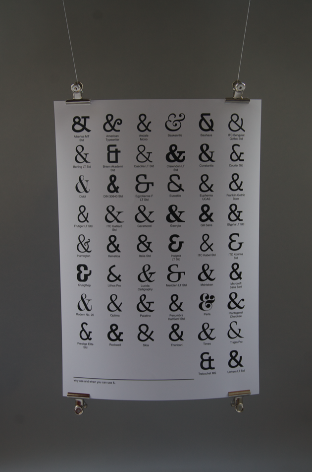
A full spread image of the poster gives a visually appealing impact and shows how the range of typefaces spreads across for this campaign. The following board the give abit more detailing into this product.

These product shots really intrigue the eye to what the poster is about. i think as an impact board on it's own it works really well.

This board shows interesting shots of the entire product range as a unit. This could possibly be used as the main impact board.